

Unlock Sales with Compelling Amazon Listing Creatives: A Comprehensive Guide
Trying to get your products noticed on Amazon can feel like shouting into the void sometimes, right? There are so many listings out there, and yours needs to stand out. Turns out, a big part of that is how your product looks. We’re not just talking about a pretty picture; we’re talking about the whole package of visuals that tell your product’s story. This guide is all about making those Amazon listing creatives work for you, so people actually stop scrolling and start buying.
Key Takeaways
Your main product image is the first thing people see, so make it count. It needs to follow Amazon’s rules and look good, even before they click.
Use your other image spots to show off the product from every angle, in use, and how it solves problems. Lifestyle shots help people imagine owning it.
Infographics are great for explaining features and benefits clearly. Keep the design simple and the text easy to read.
A+ Content and Brand Story let you connect with customers on a deeper level with more visuals and your brand’s message.
Always think about how your graphics look on phones and test different versions to see what works best for sales.
The Crucial Role of Amazon Listing Creatives
Think about the last time you scrolled through Amazon. What actually made you stop and look closer? Chances are, it wasn’t a wall of text. In today’s online shopping world, visuals are king. They’re the first handshake, the quick intro, and often, the deciding factor. Getting your product images and graphics right isn’t just a nice-to-have; it’s a must-have for anyone serious about selling.
Why Visuals Trump Text in the E-Commerce Arena
Let’s face it, people are visual creatures. Studies show we process images way, way faster than words – like, 60,000 times faster. On a busy Amazon page, where shoppers are making split-second decisions, your images have to do the heavy lifting. A strong visual can instantly communicate quality, build trust, and make your product stand out from the sea of competitors. It’s the digital equivalent of a well-dressed display in a physical store; it draws people in.
The Impact of Graphics on First Impressions
Your main product image is the gatekeeper. It’s the first thing a potential buyer sees in search results and on your listing. If it’s blurry, poorly lit, or doesn’t clearly show the product, they’re likely to just keep scrolling. A high-quality, professional main image sets a positive tone and signals that you care about your product and your customers. This initial impression is hard to undo, so making it count is pretty important.
Meeting Customer Expectations in a Visual World
Customers today expect more than just a basic photo. They want to see the product from all angles, understand its features, and imagine themselves using it. This is where good visual merchandising on Amazon comes into play. Think about it: would you rather buy from a listing with just one small picture, or one that shows the product in use, highlights its benefits with clear graphics, and even offers a size comparison? The latter builds confidence and reduces the guesswork for the buyer, leading to more sales.
Here’s a quick look at why visuals are so powerful:
Speed: Images are processed instantly.
Clarity: They show, rather than just tell.
Emotion: Visuals can evoke feelings and create desire.
Information: Graphics can simplify complex features.
The overall amazon product page design hinges heavily on its visual elements. Without compelling graphics, even the best product description can fall flat. It’s about creating an experience that guides the shopper towards a purchase.
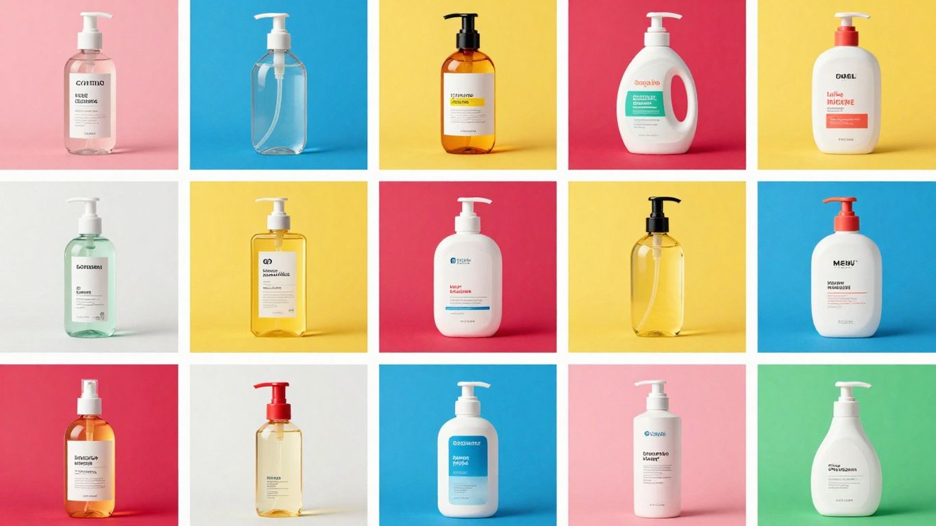
Crafting Irresistible Main Product Images
The White Canvas: Adhering to Amazon’s Primary Image Rules
Alright, let’s talk about the main image. This is the handshake, the first impression, the digital equivalent of a firm nod. Amazon has rules for this one, and frankly, they’re not suggestions. Your main image must be the product itself, crystal clear, on a pure white background. No extra props, no text, no watermarks – just your product looking its absolute best. Think of it like a clean, empty stage where your product is the star performer. It needs to be professionally lit and in focus, so there’s no confusion about what you’re selling. Getting this right isn’t just about following the rules; it’s about showing respect for the customer’s time and attention.
Zoom-Worthy Quality: Why High Resolution is Non-Negotiable
So, you’ve got your product on a white background. Great. Now, make sure it’s sharp enough to zoom into. Amazon requires images to be at least 1000 pixels on one side to enable zoom, but honestly, aim higher. We’re talking 2000×2000 pixels or even more. Why? Because customers want to see the details. They want to check the texture, the stitching, the build quality. If your image is blurry or pixelated when they try to zoom, they’ll get suspicious. It suggests you’re hiding something or just don’t care about quality. A high-resolution main image builds confidence and can actually reduce returns. It’s like letting them hold the product before they buy it.
Beyond Compliance: Making Your Main Image Captivating
Following the rules is the baseline, but we’re aiming for more than just ‘compliant,’ right? We want ‘captivating.’ Even within the strict white-background rule, there’s room for artistry. Think about the angle. Is it showing the product’s most appealing side? Is the lighting creating subtle shadows that give it depth, or is it flat and lifeless? Sometimes, a slight tilt or a carefully chosen perspective can make all the difference. The goal is to make your product look so good, so desirable, that a shopper has to click for more. It’s about making that single image do the heavy lifting of sparking interest and conveying quality instantly.
Telling the Full Story with Secondary Images
So, your main image did its job – it got them to click. Nice! But now, the real work begins. Your secondary images are where you get to chat with the customer, show off all the cool stuff your product does, and basically convince them that they need this thing in their life. Think of it like a second date; you’ve made a good first impression, now show them your personality.
Showcasing Every Angle: From Front to Back Details
Nobody likes a surprise, especially when they’re spending money. Your secondary images should give a full 360-degree tour of your product. Show the front, the back, the sides, any important details, and maybe even a close-up of that fancy stitching or the sturdy construction. This isn’t just about looking good; it’s about building trust. When customers can see exactly what they’re getting, they feel more confident hitting that ‘Add to Cart’ button. It’s also a great way to preemptively answer questions they might have about the product’s build or features.
Lifestyle Shots: Helping Customers Visualize Ownership
This is where the magic happens. Forget sterile product shots for a moment. Show your product in action, in a real-life setting. If you’re selling a coffee mug, show someone happily sipping from it on a cozy morning. If it’s a backpack, show it being worn on a hike. These lifestyle images help customers imagine themselves using and enjoying your product. They connect on an emotional level, making the product feel less like an object and more like a solution or a desirable addition to their lives. It’s about selling the experience, not just the item.
Before & After: Demonstrating Transformative Benefits
Got a product that works wonders? Prove it! Before-and-after images are incredibly powerful, especially for items like cleaning supplies, beauty products, or organizational tools. Show the ‘before’ state – the mess, the dullness, the chaos – and then the ‘after’ state, showcasing the amazing results your product achieves. This visual proof is often more convincing than any text description. It clearly demonstrates the value and the tangible difference your product can make, directly addressing a customer’s pain point and offering a clear solution.
Don’t just show what your product is, show what it does for the customer. The goal is to make them think, “Wow, I need that!”
Leveraging Infographics for Maximum Impact
Alright, let’s talk about infographics. These aren’t just pretty pictures; they’re your secret weapon for cutting through the noise on Amazon. Think of them as your product’s personal translator, taking complex features and turning them into easily digestible visual stories. Why bother? Because people are busy, and frankly, they’d rather look at a well-designed graphic than wade through a wall of text. Infographics bridge the gap between what your product does and what the customer needs to know, fast.
Simplifying Complexity: Highlighting Features and Benefits
This is where infographics really shine. Instead of just listing features, you can show them. Imagine a kitchen gadget – instead of saying “multiple blades,” an infographic can visually display each blade type and its specific function. It’s about making the ‘wow’ factor immediately obvious. This is especially useful for products with a lot of moving parts or unique selling points. For example, a skincare product could use an infographic to show its key ingredients, how they work, and the results you can expect. It’s a visual promise that builds trust.
Design Discipline: Clean Layouts and Readable Fonts
Now, just because it’s visual doesn’t mean you can throw caution to the wind. A cluttered infographic is worse than no infographic at all. Think clean lines, plenty of white space, and fonts that are actually readable, even on a small phone screen. We’re talking about a minimum font size of 30pt when scaled for mobile. Use a consistent color scheme that matches your brand – this isn’t the place to go wild with neon unless your product is, well, neon.
Here’s a quick checklist for good infographic design:
One Core Message Per Graphic: Don’t try to cram everything into one image.
Legible Fonts: If you need a magnifying glass, it’s too small.
Plenty of White Space: Let your design breathe.
Consistent Branding: Colors, fonts, and style should match your overall look.
Mobile First: Design with smaller screens in mind from the start.
A well-designed infographic doesn’t just look good; it actively helps customers make a decision. It answers questions before they’re even asked and reduces the chances of confusion or returns. It’s about clarity and making the buyer feel confident.
Embedding Keywords: Echoing Search Queries Within Visuals
This is a bit of a sneaky tactic, but it works. While Amazon’s bots don’t
The Power of A+ Content and Brand Storytelling
So, you’ve got your main image looking sharp and your secondary images telling a story. Now, let’s talk about taking things up a notch with Amazon’s A+ Content. Think of it as giving your product listing a full makeover, not just a quick touch-up. This is where you can really let your brand shine and connect with shoppers on a deeper level. It’s more than just pretty pictures; it’s about building a relationship.
Beyond Basic Descriptions: Engaging with Premium Visuals
Amazon A+ Content, and its fancier sibling, Premium A+ Content, lets you go way beyond the standard text description. You get access to special modules that allow for bigger, more dynamic images, comparison charts, and even video integration. It’s like turning your product page into a mini-website. You can showcase your product from every angle, demonstrate its use in real-life scenarios, and highlight key features with clear, easy-to-understand graphics. This visual feast helps customers get a really good feel for what they’re buying, which can seriously cut down on confusion and returns. Plus, it just looks way more professional than a plain old text block.
Building Deeper Connections: Sharing Your Brand’s Mission
Why should someone buy from you instead of the next guy? A+ Content is your chance to tell that story. You can share your brand’s origin, its values, what makes it tick. Maybe you’re all about sustainability, or perhaps you started the company in your garage with a brilliant idea. Whatever it is, weaving that narrative into your listing helps customers feel like they’re connecting with a real business, not just a faceless seller. This kind of storytelling builds loyalty and can make a big difference when someone’s deciding between similar products.
Synergy in Design: Maintaining Brand Consistency Across Creatives
Here’s the trick: all these fancy visuals need to play nicely together. Your A+ Content should look like it belongs with your main listing images. Use the same color palette, fonts, and overall style. If your main image is clean and modern, your A+ Content should be too. This consistency makes your brand look put-together and trustworthy. It’s like wearing a matching suit – everything just fits. When your visuals are all singing the same tune, shoppers feel more confident, and that’s good for sales. It shows you pay attention to the details, and that usually means your product is top-notch too.
Remember, the goal here is to make the customer feel informed and excited about your product. Think about what questions they might have and use your visuals to answer them before they even ask. It’s proactive selling, done right.
Here’s a quick look at what A+ Content can offer:
Expanded Image Modules: Use larger, more impactful images.
Comparison Charts: Help customers compare different versions of your product or even competing products.
Brand Story Module: Share your company’s journey and values.
Interactive Elements: (Depending on Premium A+ features) like carousels that let users swipe through images.
Optimizing Your Amazon Listing Creatives for Success
So, you’ve got some killer product images and maybe even a snazzy infographic. Great! But are they actually working for you? Just having good visuals isn’t enough; we need to make sure they’re doing their best work. Think of it like having a fancy car but never changing the oil – it’s not going to run optimally.
Mobile-First Design: Captivating Shoppers on Smaller Screens
Let’s face it, most folks are scrolling through Amazon on their phones. If your amazing graphics look like a jumbled mess on a tiny screen, you’re losing potential customers faster than you can say “add to cart.” Your visuals need to be crystal clear and easy to digest, even when viewed on a smartphone. This means using bold, readable fonts (aim for at least 30pt when scaled) and avoiding cramming too much text into one image. Focus on one main point per graphic. Vertical layouts often work better on mobile, filling up more of that precious screen space. Always test your images on different devices before you upload them. If it’s hard to read on a phone, it’s probably not going to convert.
The Psychology of Color: Evoking Emotion and Trust
Color isn’t just for looking pretty; it actually makes people feel things. Different colors can trigger specific emotions and associations. For example, blue often conveys trust and reliability, which is great for building confidence in your product. Green can suggest nature or health, while red might signal urgency or excitement. Think about what feeling you want your brand and product to evoke. Using color strategically can subtly influence a shopper’s perception and encourage them to click. It’s a bit like a silent salesperson working in the background. Make sure your color choices align with your brand identity and the overall message you’re trying to send. A consistent color palette across all your creatives helps build brand recognition, too.
Continuous Improvement: The Art of Split Testing Your Graphics
Never assume your first attempt at a graphic is the absolute best it can be. The market changes, customer preferences shift, and what worked last year might not be as effective today. This is where split testing comes in. You can test different versions of your main image, your infographics, or even your lifestyle shots to see which ones perform better. The goal is to identify the high-converting listing images that lead to more sales. For instance, you could test two different main images to see which one gets more clicks, or test two infographics highlighting different features to see which one leads to more add-to-carts. Tools and services exist to help manage this process, making it easier to optimize product images for Amazon and continuously refine your approach. It’s an ongoing process, but the payoff in increased sales is usually well worth the effort.
So, What’s the Takeaway?
Alright, we’ve covered a lot of ground, from making sure your main picture isn’t a blurry mess to using fancy infographics and even telling your brand’s story. It might seem like a lot, but honestly, it all boils down to one thing: making your product look good and easy to understand. Think of your Amazon listing like a first date – you want to make a great impression right away. Good visuals grab attention, answer questions before they’re even asked, and generally make people feel more confident about hitting that ‘buy now’ button. So, put in the effort, maybe even call in a friend who’s good with design (or, you know, hire one), and make those listings shine. Your sales numbers will thank you. Probably.
Frequently Asked Questions
Why are pictures so important for my Amazon products?
Think of pictures like your product’s first handshake. People look at images way faster than they read words. Good pictures grab attention right away, show what your product does, and make shoppers feel more confident about buying it. If your pictures aren’t great, people might just scroll past.
What’s the main rule for the first picture of my product?
The very first picture, the one people see in search results, has to be super clear and show only your product. Amazon wants it on a plain white background with nothing else in it. This helps shoppers quickly see what they’re looking for.
How many pictures should I use for my product?
Use as many picture spots as Amazon gives you, usually up to nine. Mix it up! Show the product from all sides, show people using it (lifestyle shots), use graphics to explain features, and show its size. The more helpful pictures you have, the better.
Can I put words or text on my Amazon product pictures?
Yes, but not on the main picture. For your other pictures, like graphics that explain features, you can add text. Just make sure it’s easy to read and doesn’t make the picture look too busy. It’s a great way to highlight important things.
What are A+ Content and Brand Story, and why should I care?
A+ Content and Brand Story are special sections where you can use more pictures and tell your brand’s story. It’s like a fancy upgrade to your product page. It helps customers connect with your brand more and understand your products better, which can lead to more sales.
Should I make my own product pictures or hire someone?
You can definitely try making them yourself, especially when you’re starting. But if you want your pictures to look super professional and help you sell the most, hiring a designer who knows Amazon is often worth it. They know how to make images that grab attention and convince people to buy.


